By Alex Mandilaras, Senior Lecturer in Economics, University of Surrey
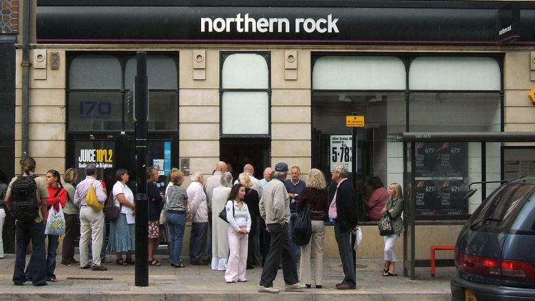
Ten years ago, fretting depositors formed lengthy queues in front of Northern Rock bank branches across the UK after news broke that it needed support from the Bank of England. The country’s fifth-largest mortgage lender, it was in real danger of running out of cash. People were anxious to withdraw their money. They all managed to do so. But not without the intervention of the Bank of England, the UK’s central bank and lender of last resort, which provided emergency funding.
It was the moment the financial crisis first became real to many. Deep-rooted issues with the global financial system had become evident a few months previously with the freezing of lending between banks. It meant that credit was disappearing and institutions like Northern Rock which relied heavily on short-term borrowing from other banks to finance their activities (like providing mortgages) had no chance of survival. The Bank of England had to act and make billions of pounds available to save them from collapse.
The reasons behind the deep freeze of the interbank market are by now well-known. Irresponsible levels of lending by US banks in the form of subprime mortgages led to large numbers of households defaulting on their mortgages when new higher rates were introduced. Then the growing tide of defaults affected house prices as banks dumped repossessed houses onto the market.
Many of these mortgages were bundled together into loans known as mortgage-backed securities, which banks across the globe were heavily invested in buying and selling. So when the value of mortgages plummeted this also destroyed the value of these securities. Banks suddenly found one of their key assets diminished. As a result, they held on to whatever cash they had. The interbank market froze – and not just in the US. The world’s intertwined financial system ensured that fear spread throughout the Western money markets.
The consequences of the resulting financial crisis were very real. In some ways, the world is still dealing with its ripple effects ten years later. The following six graphs attest to this.
1. GDP
One of the main indicators of a country’s living standards is obtained by measuring its economic output (adjusted for price changes) and dividing this by the country’s population. This is known as real gross domestic product (GDP) per person. As the financial crisis unfolded, it caused dramatic falls in real GDP in many countries. By 2008 the UK, US and Japan were all in recession – their real output had shrunk. Germany followed. Whereas most countries resumed positive growth rates by 2010, Greece continued facing a painful recession for several more years.
2. Unemployment
Recessions correspond to lower levels of economic activity so it is more difficult for people to find jobs. In the UK, the unemployment rate increased from 5.4% in 2007 to 8.1% in 2011. In Greece, where debt levels were very high even before the crisis hit, unemployment peaked at 27.5% in 2013 and has stubbornly stayed above 20% since. With the help of monetary policy and measures to instil confidence in financial markets, unemployment in the UK, US, Japan and Germany was below 5% by 2016.
3. Interest rates
The main tool used in the conduct of monetary policy is the interest rate. Following the financial crisis, and among other policy measures, central banks have slashed their interest rates in a bid to boost economic activity. The idea is that low rates give little incentive to save and higher incentive to borrow cheaply and invest, thereby getting the economy going. Japan is the only country that had low interest rates before the recession as it was already dealing with a stagnant economy, yet reduced them further following the crisis.
4. Government spending
To deal with a recession, governments can also consume and invest more themselves. To spend more, however, they need to borrow more than they already do, as raising taxes during a recession to finance government spending would further hurt economic activity. Additional borrowing by governments has been a controversial issue following the crisis. Many governments chose to pursue austerity policies, instead. The next graph shows that in the UK, government spending increases post-crisis were, on average, lower than before the crisis. In Greece, there were reductions in public spending. And in the US, too, albeit lower reductions.
5. Government debt
Post-crisis, levels of government debt have in most cases shot up. The recession meant that tax revenues were lower than planned and borrowing increased to makeup for the shortfall. In the UK, debt (as a proportion of GDP) more than doubled, albeit from a very low level by international standards. In the US, the debt ratio exceeded 100% and in Japan it exceeded 200%. Greece is heading in this direction too.
6. Current accounts
A government’s current account includes the value of its exports to the rest of the world minus its imports from it, as well as net income from investments abroad. It’s an important indicator of an economy’s health as it shows whether a country is a net borrower or a net lender. Greece’s deficit almost disappeared after the crisis, as falling incomes meant fewer imports. In contrast, in the UK, despite the fall in the value of the pound internationally, the current account deficit has increased. Germany’s surplus has overshadowed that of Japan’s every year since 2004 and the difference has become even larger after the crisis.
Not all the trends observed in the graphs can be directly attributed to the financial crisis. But the crisis did affect the world’s advanced economies in profound ways. Indirectly, it may even have led to tectonic shifts in how societies view markets, trade, globalisation, politicians, experts and each other. It remains to be seen whether alternatives such as Brexit or the US administration’s protectionist agenda, can deliver what their proponents are hopeful of.
This article first appeared on The Conversation


Be the first to comment on "Six charts that show how much has changed since the 2008 financial crisis"